Color Theory
What is color theory?
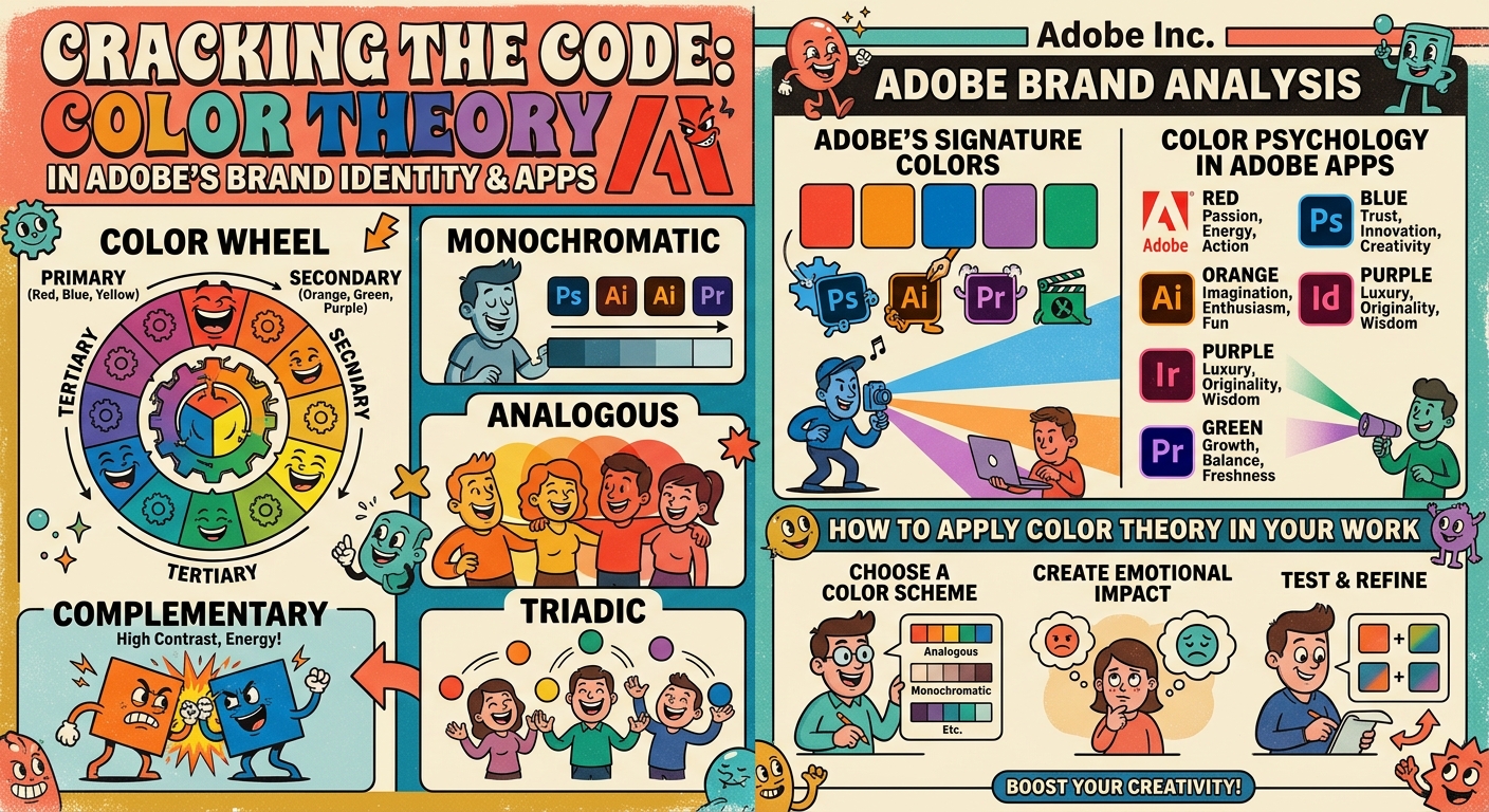
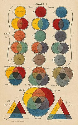
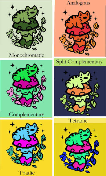
Color theory is a practical guide, on how colors impact, how we see them, and how to combine them to create visual effects. It isn't just a decorative elements, designers use them to communicate compelling messages. influence user's emotions, and shape perceptions about a brand.
How Color Theory work
Why Color theory is important for business's image?
Color palettes and color theory it's not just about aesthetics, it also communicates emotions, creates a logical structure, builds recognition, and influences in the conusmer behavior in subconscious level.
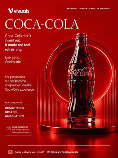
BRAND RECOGNITION
Selecting the right color can improve your brand's visibilty to up 87%, making your business instantly identifiable before the customer even reads your logo or tagline
Even though color perception is completely personal and it depends on each particular situation, there has been many studies showing how different hues trigger particular emotions and convey certain messages, which designers can use to better connect with the target audience.
When choosing a color palette it's important to consider brand personality, based on what colors suits the characteristics of our product/company
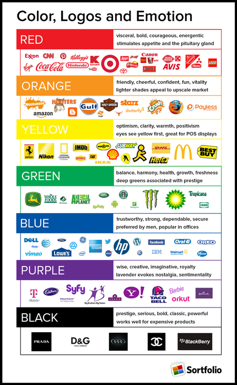
For example, some general conceptions around colors are
Blue: Reliability, trust, loyalty, intelligence, technology, dark blue meanwhile is often associated with authority, conservatiness, confidence and tradition.
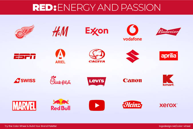
Red: Often asscociated with war, strenght, passion, love, war, energy, it is commonly used to depict romance and arise different senses: (erotic feelings, danger, apetite)
Pink: Has been associated with happiness, represents youth, and hope
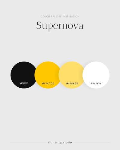
Black: Often associated with greed, desire, luxury, and mourning. It means power, absortion of all light, indepence and self control
Yellow : Often represents color of happiness, energy, attention, and intellect. This color represents a warming effect, stimulates mental activity, and generates muscle energy.
Purple: The color or royalty, nobility and luxury, the negative associations are decadence, conceit, and pomposity.
Green: Depicts healthiness, nature, productivity and relaxation. It's often related to healthy products, the environmentally conscious, and used for financial companies to depict wealth.